Why AI images get text wrong
Image models draw letters the way they draw everything else: as shapes that look right. Older models produced text that looked like writing but wasn't. Newer models are much better, and some are built for it, but the risk grows with every extra word.
So the rules are simple: tell the model the exact words, keep them few, say how they should look and where they go, and choose a model made for text.
Put the exact words in quotes
Write the text exactly as it should appear, in quotes, with the capitals you want: a poster that says “NIGHT DRIVE — LIVE”. Without quotes, the model may paraphrase, translate or invent words around your idea.
Spell out numbers and prices the way they should look, like “4.20” rather than “four twenty”, and avoid unusual symbols unless you need them.
Keep it short, and set the hierarchy
A headline of two to five words comes out right far more often than a paragraph. If you need more, give it structure: a headline, a subline, and small print, each in its own quotes, with where it sits: “title at the top”, “price list in the middle”, “address in small letters at the bottom”.
For menus and price lists, list the items in the prompt in the order you want them. For thumbnails, one big headline is usually all that reads at small size anyway.
Describe the typography
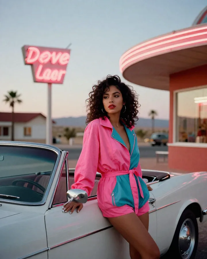
Say what the letters look like, as a designer would: bold condensed sans-serif, elegant gold serif, hand-lettered chalk, neon tubes, letters cut from paper. Add the colour and what they sit on: “white letters with a black outline”, “gold letters on dark green wood”.
Contrast matters: light text on a dark area, or the other way round. Busy backgrounds behind small text are where mistakes hide.
Pick a model made for text
All of these are in Aventada with the same credits. Each model page shows its formats and price per image.
- GPT Image 2.5: long, correctly spelled text, precise edits, wide and vertical formats.
- GPT Image 2: posters, menus and clean layouts, in every plan from Starter.
- Ideogram V3: logos, signs and posters where the lettering is the design.
- Seedream 5.0 Pro: dense layouts and infographics packed with text.
- Nano Banana 2.1: readable text for everyday images, for very few credits.
Fix a wrong letter with an edit
If one word comes out wrong, don't start over. Open the image in an edit and ask for the one change: “Change the price on this menu to 12.50 and keep everything else the same.” GPT Image 2.5 and the AI image editor are made for this kind of targeted change.
Before you publish, read every word on the image, slowly, out loud if you can. It takes ten seconds and catches the mistakes your eye skips.
Pick the format and the resolution
Choose the format before you generate, because the layout depends on it: portrait for posters and menus, wide for thumbnails and banners, square for social posts. GPT Image 2 offers square, 3:2 and 2:3; GPT Image 2.5 and the other models add wide and vertical formats.
Generate at 2K for anything people will read on screen. For print, start at the highest resolution the model offers, then run the image upscaler.
Three examples to copy
Each one quotes the exact text, sets the hierarchy and describes the lettering.
A poster for a neighbourhood bakery. Headline at the top in a warm brown serif: “FRESH EVERY MORNING”. In the middle, a basket of crusty loaves on a linen cloth. At the bottom in small letters: “Open 7am – 2pm”. Cream background, soft daylight, no logos.
A bold gym poster. Huge condensed white letters across the top: “NO DAYS OFF”. Below, in yellow: “6AM CLASSES”. A barbell on a concrete floor under one spotlight, high contrast, deep black background.
A concert poster that says “NIGHT DRIVE — LIVE” in chrome letters, with “SATURDAY · 9PM” in small white letters underneath. A desert road at dusk, purple sky, film grain.